Hi, Cool Swede!
With HealthFrame, you can
customize your reports and graphs so that you can see your data in a bunch of different ways, simply by configuring your filters. You can have multiple customizations so that you can view your reports and graphs to display the information you need, when you need it - without having to re-enter the data or delete it.
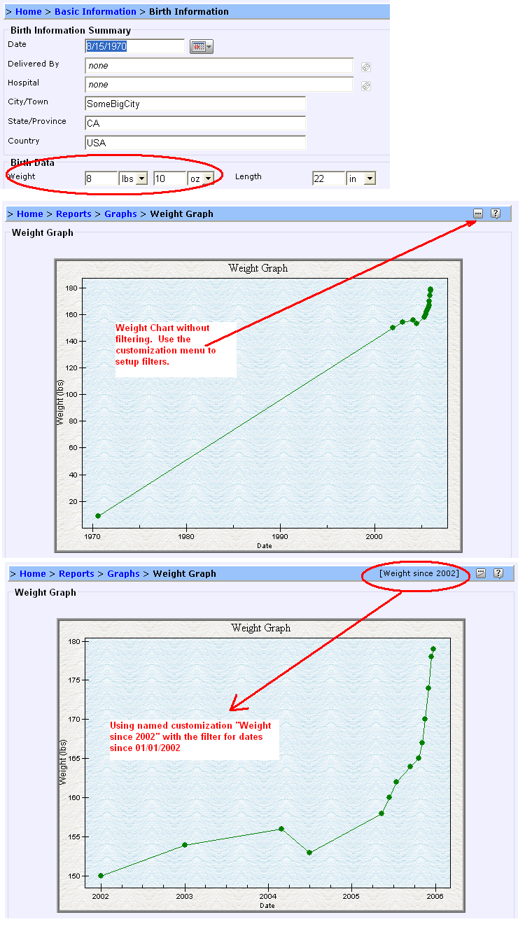
Please take a look at the sample file for Susan Marie Taylor. Her sample PHR contains her birth weight. If we show the weight chart for her with no customizations, it shows up 'bunched together' as you said. But if you create a customization, the data now shows up using a time scale that is more useful to you.
Try to re-enter your birth weight, and then try to create a customization (using the instructions in the link above). Does your data "look" better now?
Also, the data that you should be seeing when you hover over the data points on the graph should be your weight and the date/time for measurements. If that display bothers you, you can also customize it so that you don't see any 'hover' text.
Please let us know if we can be of additional assistance!
Support Team
