Thank you for following up on this thread! We're happy to hear that you are now able to see the data charted on the CDC graph.
Some of the questions/issues you raise may be addressed by the built-in
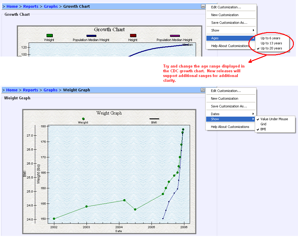
customization support. For instance, you mention the resolution of the CDC graph is too low. Please see the image below, which illustrates how you can switch out of the default (which displays 20 years) and select something more appropriate such as 6 years. Future releases will have increased granularity, supporting ranges of 6 months, 1 year and 2 years.
Displaying BMI is an option in the weight chart - this also uses the customization feature. Please see the image below illustrating the display of the BMI information for one of our sample personal health records.
It is also worth mentioning that if you have issues with some of the graph support, HealthFrame also supports
exporting data in a format that can be imported into spreadsheet programs for improved graphing to meet your needs.
Finally, to be clear, what are you suggesting with regards to the automatic formatting on a CDC percentile chart? Are you referring to the fact that the current implementation only displays the curve for the 50% percentile?
Thank you for your input and suggestions for how we can continue to improve HealthFrame!
Support Team