Records For Living Community

Share Information about HealthFrame and taking control of your own healthcare
Welcome to Records For Living Community Sign in | Join | Help
in Search

Suggestions - Providers - enhancements

Last post 06-13-2006, 7:03 AM by Dick Davis. 2 replies.
Sort Posts: Previous Next
  •  06-11-2006, 11:51 AM 333

    Suggestions - Providers - enhancements

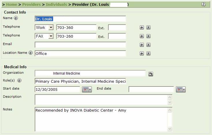
    Attachment: provider.jpg

    In the Role(s) field, can this be lengthened to the right to align and then show the full role on the screen? As you can see here in this shot, it is being cut off, not truncated but cut off in the display.


    Also, has any one requested to have more than one role for a provider? I can’t right off see a need, but it could be requested.


    Is there a reason why the name field is constructed with pre-fix, first name, middle name and last name rather than last name, first name, middle name and suffix?  This is the most common that I have seen (the last, first, middle and then the suffix). Also, you might want to give this as an option for the user to select?


    In the line that has the start date and then end date, it might be a nice feature to calculate the number of years and months that a patient has been with the provider, organization, etc. I don’t see that this needs to be on a report, but a nice calculation for the patient to know when they are recommending a specific provider.


  •  06-12-2006, 10:44 PM 348 in reply to 333

    Re: Suggestions - Providers - enhancements

    Thanks for the suggestions.

    Would you show the number of years & months with a provider/organization in the 'list' page?  Perhaps as part of that page's customization?

    Thanks,

    Support Team

  •  06-13-2006, 7:03 AM 352 in reply to 348

    Re: V2.0.2 FDD Suggestions - Providers - enhancements

    I would suggest that the "end date" field be moved closer to the label and then the caclculation for the years and months be shown to the right of the calendar icon. This is a detail that is associated directly with the "start date" and the "end date" and logically is more appropriate to be here to the right of the calendar icon. A suggestion for the calculation display would be " 10 yrs 11 months".
    *** Davis
View as RSS news feed in XML
Powered by Community Server, by Telligent Systems